01 / Brand identity
01 / VISION
Vision
DuPont Infinity Reality approached me to create a unique, innovative brand identity aligned with its vision of transformation. The system needed to express limitless possibilities, modern innovation, and confidence.

02 / ROLE & GOAL
Role & goal
As brand identity designer, I created the logo, color system, typography, patterns, brand guidelines, and interactive digital elements. The goal was a sleek, modern identity for young urban professionals and investors—consistent from print to digital.
HOW I REACHED THE SOLUTION
01
My role
I led the identity from strategy through delivery—logo, color, typography, pattern language, brand guidelines, mockups, and motion-ready digital assets.
02
Process & duration
Over nine weeks, I moved through research, positioning, concept development, and refinement, using regular client feedback to keep each decision aligned with the brand vision.
03
Primary tools
Illustrator and Procreate supported sketching and vector development; Photoshop shaped mockups and applications; After Effects brought motion to the digital identity.
03 / RESEARCH
Research
I studied real-estate branding and expectations around urban living, gathered feedback from the target audience through surveys and focus groups, and analyzed competitors to identify where DuPont Infinity could stand apart.
RESEARCH APPROACH
01
Market scan
I reviewed real-estate branding and urban-living expectations to understand how modern agencies communicate confidence, credibility, and innovation.
02
Audience input
Surveys and focus-group conversations explored which visual cues felt trustworthy, contemporary, and relevant to young urban professionals and investors.
03
Competitive audit
Competitor analysis revealed a familiar category language—sleek marks, restrained palettes, and broad technology claims—leaving room for a more distinctive idea.
DESIGN DIRECTION
Make innovation feel credible by pairing a future-facing identity with clarity, consistency, and signals of transparency.
04 / ANALYSIS & AUDIENCE
Analysis and audience
The category often relied on sleek but familiar visual codes. Audience pain points included low trust in traditional realtors and a lack of personalized, technology-led service. The identity therefore centers transparency, confidence, and a future-first outlook for urban professionals and investors.
ANALYSIS
01
Competitive pattern
The category looked modern, but often interchangeable. DuPont needed a recognizable system built around a specific promise: infinite possibility.
02
Core tension
The audience associated traditional realtors with low trust and generic service, while technology-led alternatives could feel impersonal. The brand needed to signal both progress and confidence.
03
Priority audiences
Urban professionals — modern, flexible service for fast-moving city life.
Property investors — innovative opportunities presented with clarity and credibility.
Future-focused city dwellers — distinctive experiences aligned with contemporary urban living.
DESIGN DIRECTION
Position DuPont as future-first, not futuristic for its own sake—transparent, personal, confident, and visually memorable.
05 / IDEATION
Ideation
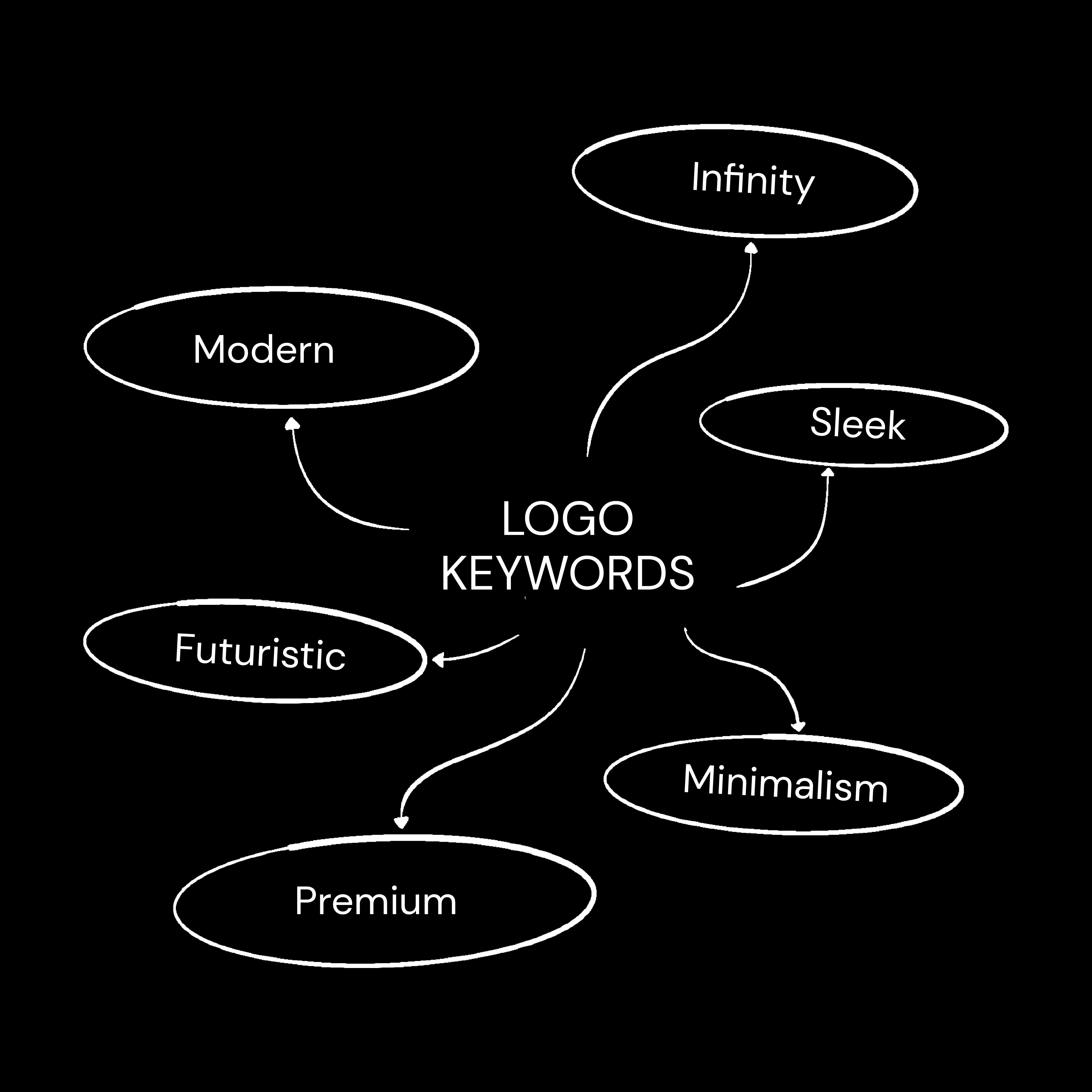
Mood boards drew from futuristic architecture, modern typography, minimalist art, and the idea of continuous growth. Sketches explored infinity symbols, city forms, and precise lines before combining D and P with an infinity motif.



06 / FINAL IDENTITY
Final identity
Client feedback shaped the final mark and a flexible visual system designed to feel modern, confident, and scalable across property signage, print communication, and digital touchpoints.


NEXT PROJECT